This is the editing process of our crime documentary. - Created by Gio
I have been using CapCut for a year or so, and Filmora for about 3 years. So, I am pretty much the experienced video editor in my group, which is why I am tasked as an editor; I have full responsibility for the editing process.
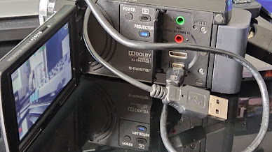
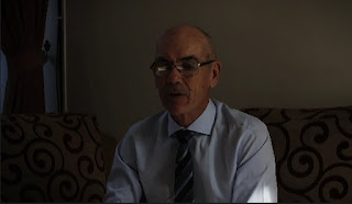
Initially, I transferred the recording from the cameras I used using a USB cable. Carrick has his own camera that he used for the interview shoots, he uploaded his recordings to Google Drive, which I had access to and it made it easier for me to download. Following this, I uploaded all video recordings and photos into the editing software, CapCut, which is the primary software I will be using.
This image shows the complete timeline of the documentary, starting from the intro to the outro. This process took approximately half a day (12 hours), and I had to skip a day from school to really lock in and finish the editing.
MAJOR EDITING CHOICES AND METHODS
Color Grading
Firstly, I decided to choose different color grading throughout the documentary to ensue different emotions in certain parts of the documentary. There are 3 main moods I'm trying to produce: warm (hopeful Tones, create connection, and highlight composure), black and white, or extreme desaturation (for a dramatic and contemplative effect), neutral with subtle cool tones (slight hints of blue to introduce an undercurrent of anticipation or to show leadership).
Here are the tools I utilize to create the intended atmosphere:
Filters, Color Adjustments, Lightness Adjustments, Luma curves, and HSL.
I mainly use the combination of filters first and then adjust color and lightness afterward.
Cuts
I decided to use J-cuts and L-cuts, they are generally used as transitions between footage within scenes instead of traditional transition effects like a fade or cross dissolve because they help the viewer keep visual continuity. I like using it because it gives people a buffer, like a cushion to get to the next place, and not make it feel awkward.
L-Cut
The audio from the previous scene continues to the next scene.
J-Cut
The audio from the next scene comes into the current scene before the visuals.
Title screen
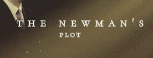
I had a dilemma on what the title screen should look like, I couldn't find a good one in CapCut (everything they have looked basic), I tried tweaking it but it didn't like it. I was trying to do something like Netflix, a cinematic-looking title screen with appealing visual effects. So, I went to alternative editing software that I had experienced, which was Filmora Wondershare, and I remember it had good effects and cinematic templates I could use.
Chroma Key (Title Screen)
By using a chroma key which acts somewhat like a green screen I added the icing to the cake, this makes the perfect visual effect for the outro of the documentary. It looks somewhat cinematic and looked professionally made.
Animation/Effects
I decided to use special effects to create appealing visualizations to better the entertainment and production quality of the documentary. Furthermore, I added animations for the text used, I did this by using the existing animation template provided by CapCut.
Text Animation
I used a feature in CapCut that allows you to modify the audio using a voice changer tool. This allows me to create unique effects and moods in the audio, which helps accentuate the mood or atmosphere I was going for in certain sections of the documentary.


No comments:
Post a Comment